Exhibition Stand Design: 15 Mistakes to Avoid and How to Do It Right
Designing an effective exhibition stand is far more complex than it appears at first glance. It's not enough to have an eye-catching idea or a generous budget: you need technical skills, hands-on experience, and a deep understanding of how people move and interact in an exhibition environment.
Every year, thousands of companies invest significant sums in stands that, on paper, seem perfect but in the reality of the exhibition don't work. Poorly organised spaces, inadequate lighting, confusing pathways, unclear messages: small design mistakes can transform a major investment into a wasted opportunity.
In this guide, we'll analyse in detail the most common mistakes in exhibition stand design and, more importantly, the best practices that make the difference between an anonymous installation and one that generates concrete results.
The fundamental mistake: designing without clear objectives
Before even discussing layout, materials, or colours, there's one mistake that undermines any project from the ground up: starting to design the stand without having defined precise, measurable objectives.
Too often, companies approach design with vague requests like "we want something attractive" or "it needs to make an impact". But what does that actually mean? Attractive to whom? Make an impact how and for what purpose?
A stand designed to generate qualified leads will have completely different characteristics from one intended for launching a new product. A B2B installation for industrial decision-makers requires a radically different approach from a B2C one oriented towards the general public.
Define the target before the pencil
The first step in any effective design consists of precisely identifying who the visitors are that we want to attract. Not "everyone who passes by", but a specific profile: purchasing directors from manufacturing companies? Architects and interior designers? Specialised distributors?
Understanding the target determines everything else: the height at which to position informational content, the tone of voice of the visual communication, the type of materials to display, even the choice of colours and the overall atmosphere.
A classic mistake is designing "to please the CEO" rather than to attract and convert the target audience. The result is aesthetically sophisticated stands that are commercially ineffective, satisfying corporate egos but not generating business.
Translating objectives into design choices
Every objective must translate into concrete design decisions. If the objective is to collect 200 qualified leads, the stand will need an efficient reception area, stations for private conversations, and a smooth contact registration system.
If the objective is to demonstrate a new industrial machine, adequate space will be needed for installing the product, a viewing zone with optimal angles, perhaps an area where practical demonstrations can be performed.
A brand awareness objective instead requires maximum visibility from a distance, memorable iconic elements, immediate messages even for those passing quickly without entering.
This strategic phase is skipped in 70% of projects, with consequences that only manifest during the exhibition, when it's too late to make corrections.
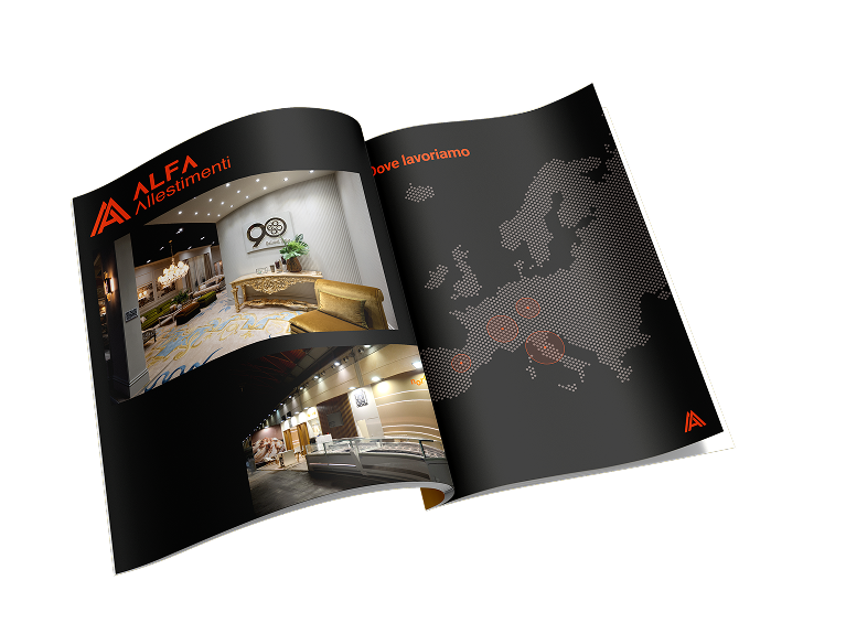
Space: how not to waste it
Space management is probably the most critical aspect and the one where the costliest mistakes are concentrated. At an exhibition, every square metre costs money, so optimising the use of available space becomes essential.
The problem of dead zones
One of the most common mistakes is creating "dead zones": areas of the stand that remain unused or poorly functional. Hidden corners where material accumulates, corridors too narrow that no one walks through, empty spaces that have no clear function.
This often happens when thinking by subtraction ("let's put the desk here, the products there, and see what remains") instead of with an integrated approach where every centimetre has a precise purpose.
The corners of the stand, in particular, are often wasted or turned into improvised storage areas. Instead, they represent opportunities: strategically positioned, they can host stations for interactive demos, small meeting rooms, or scenographic elements that attract the eye.
The illusion of total open space
At the opposite extreme is the mistake of those who design completely open stands, without any space articulation, believing this makes them more welcoming. The result is an indistinct environment, without focus, where visitors don't know where to go or what to look at.
A well-designed space has a clear hierarchy: primary and secondary areas, suggested pathways, focal points that capture attention. The objective is not to show everything at once, but to guide the visitor through a progressive experience.
Some professional designers use the concept of "rooms within the space": even in a completely open stand, vertical elements, changes in materials, or floor levels can define different zones without resorting to physical walls.
Dimensioning functional spaces
Reception desks too small where even catalogues don't fit, meeting areas where people bump elbows, corridors where two people can't pass simultaneously: these dimensioning errors are surprisingly frequent.
Precise ergonomic standards exist that should always be respected. An efficient reception desk requires at least 120-150 cm width to accommodate computers, documentation, and have working space. A private conversation area needs at least 6-8 sq m to avoid feeling claustrophobic.
Internal stand corridors should never drop below 120 cm width, and in main passage areas at least 180-200 cm are needed to allow bidirectional flow without bottlenecks.
A good designer uses scale mockups or better yet navigable 3D renderings to verify that dimensions actually work, not just on paper but in the physical perception of space.
Visitor flow: the invisible art
Understanding how people move in an exhibition environment is a skill that separates experienced designers from beginners. Visitor flow isn't random: it follows predictable patterns that should be accommodated, not opposed.
The maze mistake
Creating overly complex or winding compulsory pathways is a mistake that drives visitors away instead of guiding them. People at exhibitions walk for hours, they're tired, in a hurry: if your stand seems like a maze, they'll simply avoid it.
The ideal pathway is intuitive, almost obvious. The main entrance must be immediately recognisable, the point where to enter evident even from a distance. Once inside, visitors must instantly understand where to go without needing directions.
Island stands, surrounded on four sides, require particular attention: they should be designed with multiple clear access points, avoiding becoming impenetrable fortresses. The common mistake is creating a spectacular main front and leaving the other three sides as a "back", when in fact every side receives flows of visitors.
The golden triangle rule
There's a concept borrowed from retail design that applies perfectly to stands: the golden triangle formed by entrance, main focal point, and conversion area (where commercial conversations take place).
These three elements must be positioned so that the visitor naturally moves through them. The focal point captures attention from outside, the entrance invites approach, the conversion area concludes the pathway offering a reason to stop and delve deeper.
If these elements are mispositioned, visitors enter, look around confused, and leave without engaging. The flow must feel natural, as if the space itself suggests where to go.
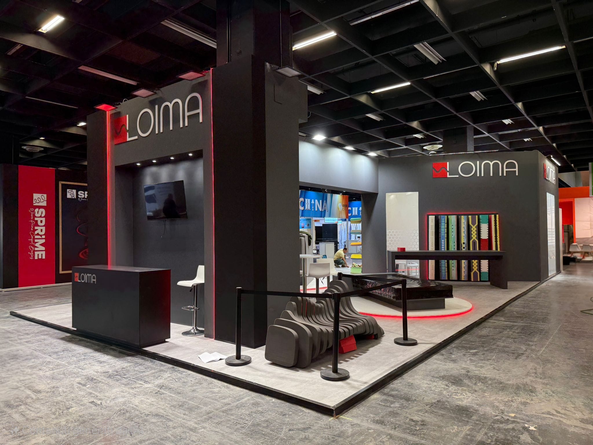
Lighting: the difference between seeing and perceiving
Lighting is perhaps the most underestimated aspect in stand design, yet it's what determines not only visibility but also atmosphere, product perception, and overall visitor experience.
The flat lighting mistake
Many stands use exclusively general, uniform lighting that illuminates everything equally. It's the safest choice, but also the most boring and ineffective.
Flat lighting creates no depth, doesn't highlight products, doesn't create atmosphere. Everything is visible but nothing stands out. It's like photographing with only flash: technically correct but aesthetically flat.
Professional lighting works on layers: a base layer that ensures adequate general lighting, an accent layer that highlights specific elements, and perhaps an atmospheric layer that creates mood without necessarily illuminating.
Colour temperature: the detail that makes the difference
Few people realise that light has colour, and that this colour drastically affects how we perceive spaces and products. Yet it's a critical choice that's often decided casually.
Warm light (2700-3000K) creates a welcoming, intimate atmosphere, ideal for lifestyle products, furniture, hospitality. Cold light (5000-6500K) appears cleaner, more technical, suitable for technology, medical products, industrial equipment.
The most common mistake is mixing colour temperatures without a strategy, creating confused environments where some areas appear yellowish and others bluish. Professional design defines a predominant temperature and uses variations only intentionally, to create specific contrasts.
Product lighting
Products deserve dedicated lighting study. A machine, a packaged product, a fabric, jewellery: each requires a different approach to be enhanced.
A classic mistake is positioning lights that create unwanted shadows or reflections. Shiny materials reflect light sources creating disturbing highlights; matte surfaces need angled lighting to reveal texture; transparent objects require backlighting to show their quality.
Professional designers test lighting on actual products before the exhibition, not just on renderings. A vase can appear spectacular in a 3D rendering and disappointing in reality if lighting isn't calibrated correctly.
Visual communication: what to say and how
An exhibition stand has just a few seconds to communicate its message. In that brief window, the visitor decides whether to approach or continue walking. Visual communication determines this crucial first impression.
The "wall of text" mistake
One of the most frequent mistakes is filling stand walls with long, dense texts that no one will read. People at exhibitions don't stop to read paragraphs: they scan, seek immediate information, want to quickly understand what you offer.
The 3-second rule is fundamental: the main message must be comprehensible in three seconds or less. If it takes longer, it's too complex or confusing.
This doesn't mean eliminating information, but organising it hierarchically. A powerful visual headline captures attention. A concise subheading explains the essence. Detailed information is available for those who wish to delve deeper, but it's not forced on everyone.
The height mistake
Essential information positioned too high or too low becomes invisible. Yet this positioning mistake is extremely common.
The optimal visual zone for crucial information is between 140 and 170 cm from the floor: the natural eye level for an average person. Information below 100 cm requires bending down and is often ignored. Information above 200 cm is only seen from a distance and loses legibility.
Large signs visible from afar work at greater heights. Detailed technical information requires comfortable reading positions. Product labels need to be at the height of the products they refer to, not arbitrarily scattered.
Fonts and legibility
Choosing excessively elaborate, decorative, or small fonts is a classic mistake that sacrifices functionality for aesthetics. An exhibition stand isn't a graphic portfolio: it must communicate effectively before being beautiful.
Sans-serif fonts (without serifs) are generally more legible from a distance. The minimum character size varies depending on reading distance: for a sign visible from 5 metres, characters should be at least 5-6 cm tall.
Contrast is crucial. Dark text on light background or vice versa works. Grey text on grey background is fashionable but illegible. In doubt, test legibility at the actual stand distance, not on a computer screen.
Materials: substance over appearance
Material choice isn't just an aesthetic matter but profoundly communicates brand values, product quality, and company positioning.
Material coherence
A common mistake is choosing materials inconsistent with the message you wish to communicate. A luxury brand using cheap plastic, a sustainability-oriented company with non-recycled materials, an innovation company with dated finishes.
Every material communicates. Wood conveys warmth, naturalness, tradition. Metal appears modern, technological, solid. Glass suggests transparency, lightness, innovation. Fabric creates softness, hospitality, dynamism.
Mixing too many different materials generates visual confusion. A well-designed stand uses a limited material palette (2-3 main materials maximum) and exploits them consistently throughout the space.
Practical durability
An exhibition stand must withstand intensive use for several days. Materials that appear perfect in renderings can reveal unsuitable for actual stress.
Touch surfaces quickly show fingerprints and dirt. Floors must withstand continuous foot traffic without immediate wear. Furniture must support repeated weight without deforming.
Experienced designers choose materials considering not only initial appearance but also how they age during the exhibition. A material maintaining its appearance for five days is better than one spectacular on the first day but shabby by the third.
Maintenance and cleaning
Some materials require constant maintenance to appear decent. White surfaces get dirty easily. Mirrors retain fingerprints. Glossy finishes show every imperfection.
If you don't have dedicated staff for continuous stand maintenance, it's better to choose materials that age gracefully and forgive daily dirt. Matte finishes, intermediate colours, textures that hide imperfections.
Plan for daily cleaning: what products can be used? Do materials allow quick cleaning? Are there difficult-to-reach areas that will accumulate dust?
Technology: when and how to use it
Technology can significantly enhance a stand, but only if used strategically, not just because "it seems modern".
The technology for technology's sake mistake
Many stands are filled with screens, tablets, and interactive systems that add nothing meaningful to visitor experience. They're there because "competitors have them" or because "we need to appear innovative", not because they serve a real purpose.
Every technological element must answer a precise question: what problem does it solve? What information does it communicate better than other media? What experience does it enable that would otherwise be impossible?
A touchscreen displaying a simple PDF that could be printed is a waste of resources and attention. A screen showing videos no one stops to watch is just expensive decoration. Technology should add value, not merely digital complexity.
Reliability and technical support
Technology fails. Not if, but when. This certainty should guide every technological choice at a stand.
The most common mistake is installing complex systems without adequate technical support plan. A broken screen on the first morning becomes a problem for the entire exhibition if no one can repair or replace it.
Every critical technological element should have a backup plan. If presentation depends on a projector, have a spare or at least printed material. If you use tablets for registration, ensure the system also works offline.
Testing all technological elements the day before opening, under actual conditions, identifies 90% of potential problems. Testing only at home or in the office doesn't reveal issues related to exhibition networks, electrical power, or interference.
User experience
An interactive system that confuses users is worse than no system at all. Intuitive interface design is crucial but often neglected.
If a touchscreen requires instructions for use, it's poorly designed. If a system doesn't respond immediately to commands, people abandon it. If navigation isn't obvious, visitors give up after a few seconds.
The best test is observing someone who's never seen the system using it without assistance. Where do they get stuck? What do they try to do that doesn't work? What appears obvious to the designer but confusing to users?
Colours: psychology and perception
Colour profoundly affects visitor perception, influences mood, attracts or repels attention, communicates implicit messages.
The excessive colour mistake
Some stands try to use all corporate colours simultaneously, creating chromatic confusion. Others add colours simply because "it was boring", without strategic purpose.
Professional design uses a limited colour palette. A dominant colour establishes identity. One or two accent colours create visual interest. Neutral colours (white, grey, black) provide balance and rests for the eye.
In crowded exhibition contexts, too many colours risk making the stand disappear in visual chaos. Better to be bold with a single strong colour than timid with many weak ones.
Context and competition
Colour choice can't ignore the surrounding context. If all competitors use blue, being the only red stand creates instant visibility. But if the entire exhibition is already a riot of colours, perhaps white minimalism stands out more.
Visiting previous editions of the same exhibition helps understand the dominant chromatic context. Requesting stand plans of close neighbours, when possible, avoids unpleasant chromatic clashes.
Some colours perform better than others in exhibitions. Red attracts attention but can tire quickly. Blue appears professional but risks being anonymous. Yellow is visible but hard to combine elegantly. Green suggests sustainability but can appear dated if poorly executed.
Psychology and cultural associations
Colours carry cultural and psychological meanings that can't be ignored, especially at international exhibitions.
Red signifies energy, passion, urgency in Western cultures, but can have negative connotations elsewhere. White represents purity and simplicity in the West, mourning in some Asian cultures. Green is universally associated with nature and sustainability, but shades vary in effectiveness.
Colour psychology affects behaviour. Warm colours (red, orange, yellow) energise and activate. Cool colours (blue, green) calm and reassure. Neutral colours focus attention on content rather than container.
The target also influences choice: a young, dynamic audience might appreciate bold colours; an executive audience might prefer sophisticated, restrained palettes.
Sound: the forgotten element
Sound is perhaps the most underestimated element in stand design, yet it profoundly influences visitor experience and can be either an attractive factor or a reason for flight.
The excessive noise mistake
Loud music, insistent jingles, repetitive videos with unmuted audio: these elements repel more visitors than they attract.
Sound at a stand must be intentional, not accidental. If you use music, it should be at a volume allowing easy conversation. If you have explanatory videos, consider headphones rather than speakers disturbing the entire area.
Remember that exhibitions are already noisy environments. Adding more decibels doesn't increase visibility, it creates acoustic stress that drives people away.
Strategic silence
In an exhibition where everyone shouts (literally and metaphorically), silence can be an unexpectedly effective strategy.
A stand acoustically isolated from surrounding noise offers refuge. Meeting areas where you can converse without shouting are appreciated. Quiet zones give visitors a break from exhibition chaos.
This doesn't necessarily mean total silence, but creating acoustic islands where noise level is significantly lower than the external environment. Using sound-absorbing materials, designing enclosed spaces, positioning areas away from main passages.
Functional sound
When sound is used, it must have a clear function. Background music creates atmosphere but mustn't dominate. Product demonstration audio must be intelligible but not intrusive.
Directional audio systems allow sound focus only where needed. A demonstration area can have clear audio without disturbing other stand zones or neighbours.
Testing acoustics under real conditions is essential. What seems acceptable in an empty stand becomes unbearable when the exhibition is crowded and overall noise level rises.
Accessibility: designing for everyone
An accessible stand isn't just a legal obligation but a moral commitment and commercial opportunity. Excluding people with disabilities means losing potential customers.
Physical accessibility
Steps, narrow passages, overly high desks: these barriers exclude visitors using wheelchairs or with reduced mobility.
A stand should be navigable without architectural barriers. Entrances without steps, sufficiently wide corridors (minimum 90 cm for wheelchairs, 120 cm comfortable), lowered desk areas for serving people in wheelchairs.
Exhibition venues often have specific accessibility regulations. Knowing and respecting them from the design phase avoids costly last-minute adjustments.
Visual and cognitive accessibility
Accessibility isn't just about wheelchairs. People with visual impairments need high contrast between text and background, adequate font sizes, non-graphic-only information.
People with cognitive difficulties benefit from clear, simple communication, intuitive layouts, not excessively complex spaces.
Interactive elements should be intuitive and offer clear feedback. If a touchscreen doesn't respond or a system is complicated, it becomes frustrating for everyone, not just those with difficulties.
Sustainability: designing responsibly
Environmental sustainability is rapidly moving from "nice to have" to fundamental requirement. Visitors, especially in evolved B2B markets, also evaluate this aspect.
Materials and end-of-life
The most common mistake is designing "disposable" stands destined to become waste after a single exhibition. It's an economic as well as environmental waste.
Recyclable materials, reusable modular structures, interchangeable components: these choices allow amortising the investment across multiple events whilst reducing environmental impact.
FSC-certified wood, aluminium (infinitely recyclable material), recycled PET fabrics: sustainable alternatives exist for practically every traditional material, often without compromises on quality.
Designing for disassembly means creating structures that dismantle easily, with components separable by material, without permanent adhesives or processes that make recycling impossible.
Energy efficiency
LED lighting has revolutionised this aspect: it consumes 80-90% less than previous technologies, lasts much longer, produces less heat (reducing load on air conditioners).
But efficiency goes beyond LED technology. Systems with presence sensors that switch off lights in unused areas, programmable timers, dimmers to adapt intensity to real conditions: all choices that reduce consumption and costs.
Screens and digital systems should have standby mode or automatic shutdown during breaks and closures. A monitor remaining on all night consumes needlessly and wears prematurely.
Logistics and transport
Transport represents a significant component of environmental impact. Modular, lightweight stands require fewer journeys and smaller vehicles compared to heavy custom structures.
Working with local contractors, when possible, reduces transport distances. For international exhibitions, evaluating suppliers in the destination country instead of shipping everything from Italy can make both economic and environmental sense.
Reusable packaging instead of single-use materials, volume optimisation to reduce empty spaces in transport, choosing couriers with low-impact fleets: details that together make a difference.
Communicating sustainability
If you make sustainable choices, communicate them. Not in a self-congratulatory way, but as transparent information for visitors who appreciate these values.
A small panel explaining materials chosen, certifications obtained, the company's environmental commitment: it adds perceived value and demonstrates consistency between declared values and concrete actions.
But beware of greenwashing: claiming environmental commitments whilst using problematic materials or generating evident waste destroys credibility more than building it.
The final phase: from idea to reality
Even the best project can fail if the realisation phase isn't managed correctly.
Rendering isn't reality
3D renderings are marvellous but idealised tools. The light is perfect, materials impeccable, there are no imperfections. Reality will inevitably be different.
The mistake is approving a project based only on renderings without verifying technical feasibility, real costs, production timescales. Many unpleasant surprises derive from elements that "worked in renderings" but in practice are impractical.
Physical prototypes, material samples, scale mockups: these intermediate tools help validate design choices before committing to expensive productions.
Coordination with suppliers
The designer creates the concept, but graphic materials, lighting technicians, technologists, contractors: each contributes with specific skills. Coordination between these actors determines the final result.
The mistake is treating them as passive executors instead of expert consultants. A good lighting technician can suggest solutions that improve the project; an experienced graphic designer knows which files to prepare for each medium.
Coordination meetings, early project sharing, cross-checks: investing time in communication almost always prevents costly production errors.
Pre-exhibition testing
Assembling complex elements for the first time directly at the exhibition is a recipe for disaster. Pre-assembly at the company, even partial, identifies problems when there's still time to resolve them.
Verifying that graphics fit perfectly in frames, that spotlights actually illuminate planned areas, that technological systems work: these checks avoid last-minute improvisations.
Actual assembly time at the exhibition is always shorter than expected. Having certainty that everything fits correctly reduces stress and allows dedicating energy to refinement and optimisation instead of solving emergencies.
Final checklist: questions to ask yourself
Before definitively approving a project, verify that it answers these critical questions positively:
Is the stand visible and recognisable from at least 15 metres away? If the answer is no, strong vertical elements or chromatic contrast are missing.
Is the main message comprehensible in 3 seconds? If it takes longer, communication is too complex or confused.
Are there at least three good reasons why a visitor should stop? If you can't find them, attractive elements or evident value propositions are probably missing.
Are spaces correctly dimensioned for intended functions? Check desks, meeting areas, corridors, display zones: each has minimum requirements to respect.
Is lighting adequate and does it create the desired atmosphere? Check both technical aspects (amount of light) and emotional ones (temperature, direction).
Are chosen materials consistent with brand positioning? Luxury, sustainability, innovation, tradition: each message requires material consistency.
Does the budget include adequate margin for contingencies? A 5-10% buffer avoids stress and allows seizing last-minute opportunities.
Do backup plans exist for critical elements? If technology breaks, if a material arrives damaged, if weather compromises external elements: do you have ready alternatives?
Designing means deciding
Ultimately, designing an effective stand means making hundreds of micro-decisions coordinated towards a common objective. There are no universally correct solutions: there are solutions correct for that brand, that target, that moment, that budget.
Mistakes almost always arise from lack of strategy, superficiality in analysing details, or uncritical copying of trends without considering the specific context.
Best practices, conversely, emerge from deep understanding of objectives, respect for visitors' perceptual and behavioural dynamics, maniacal attention to execution details.
An excellent project isn't noticed for spectacular individual elements, but for overall coherence: every element supports the others, nothing is random, everything contributes to the objective. It's this balance that transforms a stand from simple physical presence to strategic business tool.